Table of Contents
Where are you?
A couple months ago, Andrew came across a link showing the Peters projection map, and we got to talking about it. I recall seeing this during one of my favorite episodes of West Wing (“Somebody’s Going to Emergency, Somebody’s Going to Jail”), so I was familiar with the debate between the Mercator vs the Gall-Peters projection maps. Central to this debate is the following question:
What do maps have to do with social equality?
In recent months, there has been a lot of rhetoric about black lives matter, and when you think of unearned advantages and disadvantages, it seems geographical representations have also created both a land-mass bias and a northern hemisphere bias.
Kinda boggles the mind, doesn’t it?
Some time has passed since this episode, so I took this discussion a little further to try to see if there is a better projection map out there.
Land-centric Map
Geoawesomeness spent a little time researching this same question in their article, “Which is the best map projection?” The crux of the issue is taking a 3 dimensional object and attempting to represent it in 2 dimensions, without any distortions to shape, distance, direction or land shape.
The findings of three of the maps are summarized below:
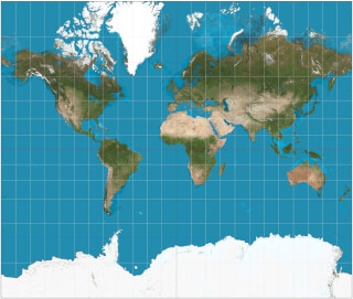
Mercator was designed as a navigational tool for sailors as it was most convenient to hand-plot courses with parallel rules and triangles on this map.
Pros: Sailors loved it; preserves angles and directions in a small area
Cons: Bad for understanding the real size and shape of continents and countries
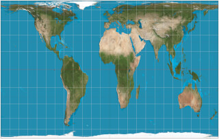
Peters argued that by enlarging Europe and North America, Mercator maps were giving white nations a sense of supremacy over non-white nations.
Pros: The only ‘area-correct’ map of its time
Cons: Galled the cartographic community in the 1980s
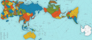
AuthaGraph realistically represents all oceans and continents, including the neglected Antarctica.
Pros: Most accurate; will win you Japan’s biggest design award; can be folded into a 3D globe
Cons: The Arctic Circle gets somewhat squashed
I kinda like the representation shown in the AuthaGraph map. I also like its origami nature. If you want to learn more about this topic, check out Geoawesomeness to see various other projection maps and their pros and cons.
Ocean-centric Map
As you can see from all the examples above, these are all land-centric maps. And if representations of the world can be redrawn to suit different purposes, why not draw one that is ocean-centric?
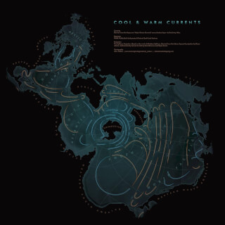
A couple years ago, an ocean-centric map went viral. The Spilhaus projection map was authored by Athelstan F. Spilhaus, a South African-American geophysicist and oceanographer, who created this projection back in 1942. The map centers on Antarctica and presents the 5 oceans as one body of water.
Above, is a map of ocean currents created by John Nelson using the WGS 1984 Spilhaus Ocean Map in Square projected coordinate system in ArcGIS.
Finally, a world that is all about oceans.
Do you think you know where you are?
We also came across a charming video from Tom Cunliffe on his Youtube channel, Yachts and Yarns. In the video, he describes how sailors would be able to track their distance using a Walker Log, and he talks about expectations about accuracy. The Walker Log method gives you information to a precision of 1/4 nm.
With the introduction of GPS, do you really need to know where you are with any more precision than 1/4 nm? He argues it is completely irrelevant.
Check out the video to learn more.
What day is it?
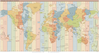
Our final inspiration about where we are in the world is also understanding when we are. A few months ago, as we were working on the redesign of serenadewind.com 2.0, I discovered the date and time wasn’t working the way I expected. Working in the production environment, I wanted a post to appear on a Monday, however, it would appear on Sunday.
After some researching, I discovered the reason is that the Jekyll front matter uses a construct called Coordinated Universal Time (UTC). In Jekyll, a date is specified in the format YYYY-MM-DD HH:MM:SS +/-TTTT; hours, minutes, seconds, and timezone offset are optional.
After much discussion over timelines for committment changes, pushing content, building the website, and the publish time of the latest post, we finally had it all sorted. I am by no means adept at this; at least, I’m not quite so much in the dark anymore.
That is… until you look at UTC -10, -11 and -12. Notice the notch in the line. What gives?
When are you?
The International Date Line is in fact not a straight line along the 180 degree meridian. For more on this, check out this video from Johnny Harris. Crossing timezones is one thing, but crossing dates is a whole other matter when it comes to commerce and travel.
How can the sun set at the same time on two adjacent islands and yet fall on a Monday on one day (Diomede Island) and on Tuesday on the other (Big Diomede Island)?
Kiribati falls on the west side of the 180 degree meridian and yet they choose to be on the eastern hemisphere timezone (with Australia and Asia), yet the Cook Islands due south is associated with the western hemisphere (with the United States).
Keep in mind that some of the most beautiful islands in the world are located along the International Date Line, and each of the countries were able to choose which side they wanted to be on.
That’s right… They got to choose.
Curiously enough, since 1884, maps over the years would have a different International Date Line drawn before and after whenever the country would make its choice.
So imagine flying from New Zealand to Hawaii. On your way, you will cross the International Date Line a few times over the course of 11 hours. You begin on Tuesday in New Zealand, fly over the Cook Islands and it’s Monday, then over Kiribati Islands and it’s Tuesday again, and then land in Hawaii on Monday, having traveled back in time.
All this to say, once we are sailing in the south Pacific, it’ll be useful to keep this in mind. Or we can just appreciate the sunsets and ignore what day it is.
Thanks for your time.
Thanks for reading!
Share Where and When with your friends:
Stay up to date with our content releases, by subscribing to our RSS Feed or follow us on Facebook and Instagram.
 If you would like to delve deeper into our adventure as it unfolds, please consider joining the Serenade Wind Crew. Our sister site provides more information on what it means to be part of the crew, unlock the pirate’s booty, and receive other exclusive access and benefits.The first 50 members have a gift waiting.