Table of Contents
Logo Considerations
I still shake my head when I think of how many millions of dollars were spent by my old company on creating a new logo. Warner Bros. especially has an iconic logo - the WB shield - which has evolved over the decades. The updated logo looks pretty much the same as the one from a previous era (1953-1967, 1970-72, and 1985-2019). Despite this, I thought the animation of its transformation pretty cool.
As for Serenade Wind, both Andrew and I thought about designing our own logo and at the same time level-up on skills using illustrator and animator tools. This seemed to us a good idea. After a little more consideration, the question became whether or not this skillset would be something that could be put to use on an on-going basis.
We thought about it in the context of all the other things we were tackling in the near-term. These included:
- downsizing/purging,
- maintaining the content for this website (v 1.0),
- redesigning the website (v 2.0),
- working full time (Andrew), and also
- getting up to speed on diesel mechanics and boat systems, etc.
At first blush, it did not seem likely that we could invest in the time to learn. Nor did it make sense to invest in the licenses for products such as Adobe Illustrator or After Effects.
We only went so far as to research free alternatives for vector editors or video effects, before things fizzled. And we also notionally described our wish to stay somewhat contemporary and referred to some current trends in logos to get some ideas that could possibly incorporate movement, wind and possibly song. But these were exploratory discussions and we didn’t take things further.
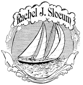
Previous Logo
We wanted to start with a profile of s/v Rachel J. Slocum. She’s an eye-catcher, so why not take advantage of her clean, beautiful lines while under full sail?
Unfortunately, we didn’t have any photos of her that we found suitable. So we reached out to Bill for some high resolution photos. I thought we could take advantage of an offer by fellow sailor and graphic designer to take the photo and create a vector graphics file.
However, while he searched for some high resolution photos to share, Bill also sent us a logo he had created some time ago. The logo certainly evokes a certain era in the past… a romanticized era, perhaps, of the age of sail. We love it and we want to be able to use it in some form while at the same time update it to something more contemporary.
It soon became apparent that we were out of our depth. So we decided to enlist the help of experts and in this case a good friend Nick who designs for a living at leading gaming and tech companies.
Branding
When I was in business school 20 years ago, I thought marketing was cool but also hokum since it couldn’t be measured and tracked. And during the early days, when online businesses were just beginning to launch, this was true… and certainly it’s still true when you look at advertising spending in offline mediums.
Life seems to come full circle and once again, I’m learning to go with the flow.
So it is now 20 years later that I am wrestling with brand development and website design. Even though the topic of this blog post is the introduction of a new logo, Andrew reminded me not to think about the logo in isolation, but how it can work in the context of its various use cases, to which I asked,
What’s a use case?
Andrew patiently explained how the logo could be used, for example a static image printed on a baseball cap, animated logo on a website, etc.
We then went on to discuss a number of items to decide upon so we can give Nick a few parameters when we engage him on some work for Serenade Wind. Andrew asked me to come up with a list to discuss, so I am annotating them here for my reference as well as for others.
Hiring a web designer
Before you have a conversation with a web designer, come prepared with answers to the following topics:
- Define the use cases for the logo?
- physical static image printed on a leather tab sewn onto hand knit items
- static image for a rubber stamp to be applied on other cruiser’s guest log books
- digital asset (static and animated logo) on a website / podcast
- animated logo as an intro/lead-in on a video
- What is the point of the logo?
- mood - contemporary, clean lines, distinctive, memorable
- message - modern-day exploration, discovery, adventure
- vibe (the energy of the abstract qualities that come through a brand)
- color
- typography
- graphic style
- layout
- elements to incorporate
- movement and song to tie in to the name “serenade” and “wind”
- primary use of initials “s” and “w”
- secondary use of words “serenade” and “wind”
- Before engaging a web designer, what is the scope of work?
- color palette
- font
- logo
- new layout / design Serenade Wind.com
- other?
- What are things that you like? Search for and provide patterns, themes, photos, art, images that define your style
Aesthetic
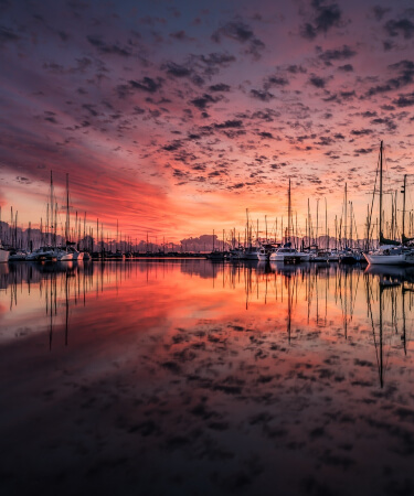
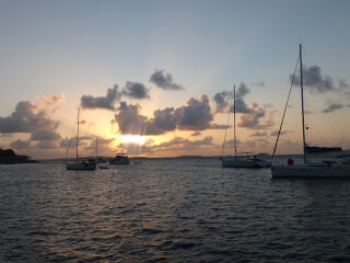
I have no idea how a designer can generate an aesthetic based on these images. Nonetheless, here is a photo gallery of what we chose.
Scope of Work
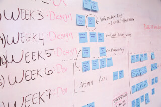
After digging deep, it’s time to come up with a list and next to each item, define your objective.
- Logo - design to be used in static uses and animated uses (see use cases above)
- Color palette of web - our favorite colors are blue (Andrew & Denise) and silver (Denise)
- Home page design/layout - optimized for mobile
- Navigational design/layout - clear paths since only 2-3 pages per session before bounce; average session 2+ minutes
- Layout of static pages vs time-based pages - collections (technical corner, recipes, fiction) vs blog
After a further discussion with Andrew, he boiled it down to 2 asks: a minimum brand guide and logo design.
A few weeks later…
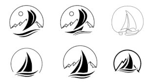
Which do you like? Send us a comment letting us know what you think.
Early Drafts
Andrew and I both had a chance to evaluate the 6 options that Nick presented and we both gravitated to the ones in the center:
Top center - this had 3 layers of perspective, with the sailboat in the foreground, mountains in the middle and sun in the background. We liked the hint of movement and wind, the simplicity of the lines and the reference to exploration having the mountains in the background.
Bottom center - this is a cleaner and bolder version of the top center, giving more prominence to the sailboat with the hull below the waves. This could easily have the sun placed in the half dome horizon to give us the background depth we liked in the first example.
In our discussion, we wanted to see whether having a profile of a schooner with two masts would muddy up the design, so we asked Nick to work on one version with 3 sails instead of 2. We also spent a little time talking about a third option.
Top right - this line drawing also stood out because it evoked a signature. It’s a one-of-a-kind, much like s/v Rachel J Slocum herself. When the owner oversaw her construction, the molds were destroyed to guarantee that she is unique among all sailboats. So it is with the third logo option. Andrew wondered if somehow an element of Japanese Sumi-E brushstroke painting could be incorporated.
It certainly felt like we were close and Nick was happy to take on the additional feedback and draw up a few more examples.
Later that week…
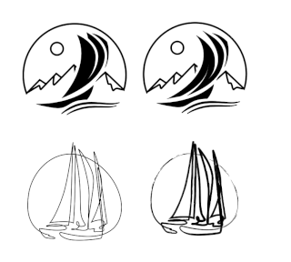
Of the images that Nick provided us, we were drawn to the logos to the left, although interestingly enough, the top right logo incorporates the initial “S” and “W” in the design, which is pretty cool. It’s pretty amazing how Nick could take account of these random ideas we came up with and have it reflected in a cohesive design.
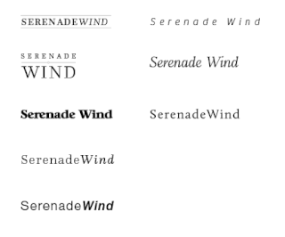
After settling in on two choices, Nick began to tackle typography. Of these choices, we happened to like two of the designs. Can you guess which ones?
Introducing New Logo
So after a few short weeks, we settled in on a logo that works and exemplifies all of the design elements we asked for from Nick. As you can see, it was an iterative process, but is made successful working with a designer who listens and can translate your ideas into a visual, succinct representation of your aesthetic.
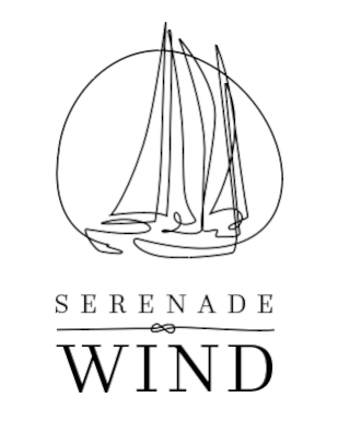
Here is an early color version of the new logo.
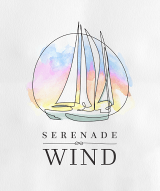
We really love the look of this. The image also incorporates a whimsical “S” and “W” below the sails. The logo ties in with RJ Slocum itself. RJ Slocum is a custom build and one-of-a-kind. You’re not going to find a boat like this anywhere else… All the more reason to have a one-of-a-kind logo.
Stay Fluid
Branding largely follows the same principle as traditional publishing. Once designed, the logo or brand is locked in for some time so that the consumer recall can be consistent.
While we will give a nod to marketing principles, our presence is digital and lives primarily on the web. Unlike traditional publishing, websites allow for quite a bit of fluidity in how content is presented and announced.
We wanted to share the logo creation process and hope you find it helpful. If you want to get in touch with Nick or see more of his work including web design, motion graphics/VFX, and illustration/digital, check out his website.
Thanks for reading!
Share New Logo with your friends:
Stay up to date with our content releases, by subscribing to our RSS Feed or follow us on Facebook and Instagram.
 If you would like to delve deeper into our adventure as it unfolds, please consider joining the Serenade Wind Crew. Our sister site provides more information on what it means to be part of the crew, unlock the pirate’s booty, and receive other exclusive access and benefits.The first 50 members have a gift waiting.